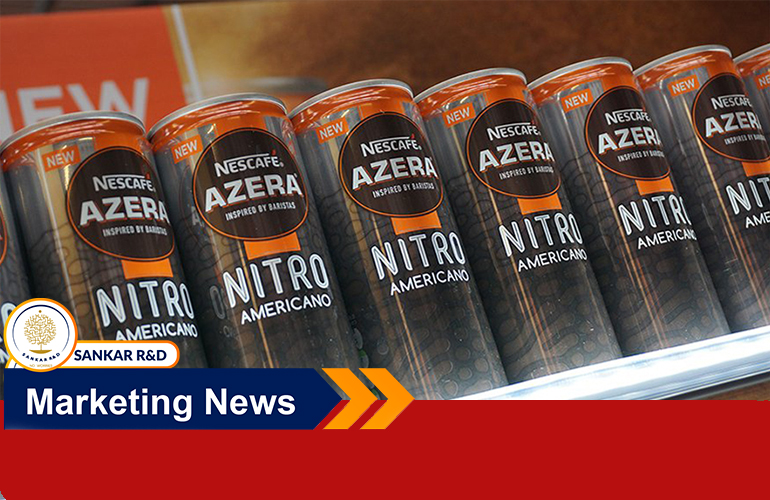
Nescafé is overhauling its premium coffee brand, Azera, introducing a new brand positioning and visual identity as it looks to maintain its “competitive edge” amid the booming coffee market.
The new positioning aims to move the brand up the benefits ladder by shifting its communications from functional to emotional. To do that, it will focus on the idea of curiosity with an £8 Million master-brand campaign.
Vassilis Karalis, head of the Nescafé Azera brand, tells Marketing Week: “We felt, and have seen, that the competition has become more intense and some brands have been coming closer to us so we have had to make sure we kept our competitive edge”.
Karalis explains: “[Before] we had a very clear proposition but we’ve seen our competitors come in and try to take advantage of our assets. We’ve seen the orange color popping up in smaller brands and we’ve seen barista language becoming a common language in the coffee sector. We wanted to push it a bit further and continue our momentum.”
The new campaign sees Nescafé Azera bring together all its products – including soluble coffee, ready-to-drink, coffee bags and cold coffees – under one master-brand for the first time. The campaign will focus on a message of curiosity, both around “curious coffee recipes” but also curiosity about the way people live and see life.
Karalis explains: “We wanted to ingrain Nescafé Azera as a lifestyle brand and make it clear it’s a coffee brand that operates in different segments.
“However, at the same time we are not the biggest brand in the coffee landscape so we have to do it in the right way. We reasoned we should invest in being bigger and bolder in our communications.”

The re-brand is based on a “proactive” strategy that aims to ensure Nescafé Azera, which is owned by Nestlé, stays ahead of competitors.
According to the brand, its sales have been growing at a double-digital rate and its market share has increased, but recently competitors have begun to close the gap.
Karalis explains: “Our competitive margins haven’t been closed but they have been narrowed so we wanted to widen them once again and keep the brand one step ahead. We have seen more competitors focusing on above-the-line as lifestyle brands so we felt we had to move on before it’s too late.”
The changes to the visual identity are subtle, with the orange on-pack strip changing from one line down the middle to a series of dots. Karalis says this opens up the potential for more changes but that he didn’t want to change too much too quickly.
“If you suddenly start doing very [major] changes it means you probably haven’t been fast enough in the market,” he notes.
Quoted from Marketing week


